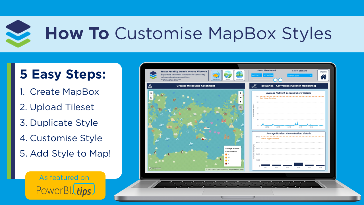
Posts in Mapping
When NOT to use Power BI for creating public engagement and communication tools

This blog post unpacks several considerations for when⚠️ NOT to use Power BI ⚠️ to create public engagement and communication tools. This is based on our recent experience working collaboratively with Charles Sturt University (CSU) to create a custom scripted public-facing online interactive tool to help communicate river and environmental flow data, and fish survey results across the Edward/Kolety-Wakool River system in southern New South Wales.

Read More
Tips and tricks to simply your spatial files using QGIS and MapShaper for mapping in Icon Map in Power BI

Displaying very detailed spatial files using WKT in the Icon Map comes with it’s challenges – the biggest being poor performance (i.e. very slow to render). Some simplification and reduction of precision can go a long way  In this video blog I walk through some of my tips to simplify and reduce precision of your spatial files (using free tools such as QGIS and Map Shaper) BEFORE importing into Power BI as a WKT file to really improve rendering speed and avoid exceeding the 32,766 text character limit in Power Query. I hope this helps you have fun exploring maps in Power BI.

Read More
Processing detailed WKT polygons for Icon Map: Power Query and DAX magic to exceed the 32,766 text character limit in Power BI

Sometimes we want to display highly detailed spatial files in Power BI using WKT text strings in the Icon Map custom visual… BUT Power Query has a text character limit of 32,766 characters per data point - so what can we do?!? In this video blog I walk through some Power Query and DAX magic to split up our WKT text string and then stitch it back together using CONCATENATEX. I also go over a very frustrating ‘gotcha’ where Power BI removes the lagging spaces in our text string on import (which causes errors in our WKT file) and how to resolve it. I hope this helps you have fun exploring maps in Power BI.

Read More
Welcome to Icon Map for Power BI

Working across the environmental industry – it’s fair to say that pretty much ALL of DiscoverEI’s Power BI reports have a map! And if you thought that MapBox was good, well you’re going to LOVE the Icon Map custom visual in Power BI – which allows you to display interactive polygons, points, lines and of course – icons, all in the one visual…plus so much more! To really appreciate how Icon Map can be used to visualize real world data, in this video blog I walk through two real-world applications of Icon Map to visualize environmental data. A big shoutout and thanks to James Dales for creating this awesome visual!!

Read More