
When NOT to use Power BI for creating public engagement and communication tools
We all know that Power BI is an amazing tool for processing, modelling, calculating and presenting your data - and from our last blog we saw that it can also be a fantastic stakeholder engagement and public communication tool for presenting information to non-technical audiences… But there are some instances where Power BI falls shorts and might not be the best tool for the job.
This blog post unpacks several considerations for when⚠️ NOT to use Power BI ⚠️ to create public engagement and communication tools. This is based on our recent experience working collaboratively with Charles Sturt University (CSU) to create a custom scripted public-facing online interactive tool to help communicate river and environmental flow data, and fish survey results across the Edward/Kolety-Wakool River system in southern New South Wales.

Image of the wet tool home screen. Click on the image or button to navigate to the web tool to take a look
⭐ Consideration 1: Customised user navigation
There are lots of tricks to achieving a great user navigation experience in Power BI - but sometimes you need to have a more customised user navigation experience based on what data the user has selected. In our case, the user navigation experience was to allow users to first select a location from the infographic map. Based on the type of location selected, the information provided would be different (i.e. fish survey data, latest water quality data, etc.), and then the user would have options to click into the various screens to get even more information.
While this may have been able to be achieved in Power BI with a very sophisticated (but clunky) array of buttons and bookmarks, we would not have been able to achieve such a customised user navigation experience without A LOT of future maintenance and headache. Using a lot of buttons and bookmarks to display hidden pages in Power BI also runs the risk of keyboard trap for those users who need to navigate the report via keyboard navigation (resulting in a not so accessible report). Custom scripting a tool enables all of these navigation features to be coded and for the designer to have a lot more control over the user experience.
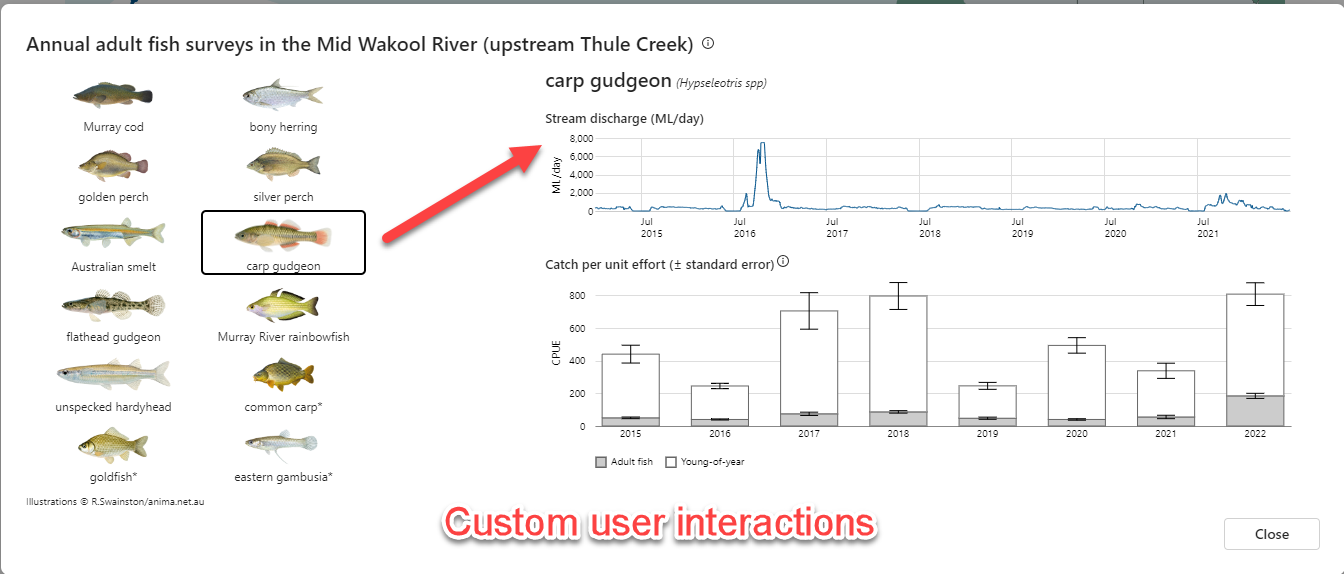


⭐ Consideration 2: Customised visuals and functionality
While we have a lot of different out-of-the-box visuals to chose from in Power BI, there may not be one that meets the needs for how you want to visualise your data. The amazing custom visual Deneb (by Daniel Marsh-Patrick) goes a long way to filling this gap, but you might be looking for other customisations to your web tool which just can’t be achieved in Power BI. In our case study, the following features and functionality could not be (easily) replicated in Power BI:
Map tooltip pop-up: Ability to zoom and pan around the interactive map AND click on an icon to launch a pop-up. While we may have been able to achieve this with a clunk work-around in Power BI using buttons and bookmarks, we wouldn’t have been able to have this and the pan and zoom feature.
Expand and contract page size: On the detailed water quality pop-up pages, users have the option to dynamically display and hide different time-series charts, which results in the page size expanding / contracting to fit to the number of charts to display. There may have been an option to achieve this functionality in Power BI using the small-multiples feature, but not with the desired customisations to the chart look and feel for the different time-series (i.e. to fill the plot area vs. line)
Custom rendering messages: On the water quality time-series pages, we are bringing in live data via an API, and this can take several seconds to render (depending on the users internet speed). We were able to customise the loading message (i.e. ‘Loading conductivity data. Please wait.‘) to alert users that the data was being loaded. In Power BI, we’ve all no doubt seen the spinning dots icon while we wait for a visual to render, but there is no option to display a customised user message to alert the users that the tool is not broken, but just rendering.
There were various other charts and visuals (box and whisker plots, images, icons, user instruction pop-ups) which while each may have been able to be replicated in Power BI, it would have involved a lot of extra work to tie all the features together into a Power BI report, which would have been very complex to maintain and update.


⭐ Consideration 3: Look and feel
If you’ve been using Power BI for a while, you can pretty instantly recognise when a report has been created using Power BI, and maybe go as far to identify what visuals / Power BI hacks have been used. Power BI has a distinct look and feel…and it might not be what you are after with your web tool. You might need the web tool to interact with other elements on the web page, which may be achievable using Power BI embedded, but this comes with added hosting costs and may not achieve what you are after. Also, if you are using Power BI publish-to-web, be aware that mobile responsiveness is not supporting. In our case study, it was important to achieve a good user experience on mobile and tablet devices, so publish-to-web was not a great option. Additionally, if you would like to use customised fonts and integrate with the existing website theme package, then this may not be achievable in Power BI (while custom fonts are supported, they need to be installed on the users machine). In our case study, the webtool is using the website theme file, so any changes to the master theme file are directly reflected in the tool. Creating a custom tool also has the benefit of a lot of control over the design elements and features that aren’t achievable in Power BI.

While we’ve just discussed our 3 considerations which we faced in this case study when assessing whether Power BI is the right tool for creating public-facing web tools, there are many more things to consider such as:
What functionality do you want in the tool (i.e. do you want write-back to a data base, do you want live data feeds, etc.)
Do you have existing Power BI infrastructure and skills in-house to develop and maintain publish-to-web or Power BI embedded solutions?
Do you have the skills in-house to create (and maintain) a custom scripted webtool
Do you have budget for hosting services (in which case Power BI embedded may be a good option)
User security and customisation
Accessibility requirements
and the list goes on…
We hope this blog has been helpful and given you some things to think about when considering using Power BI to help bring your data to life and share it effectively with the general public!
💙 Connect
We'd love you to connect with the DiscoverEI team:
Email: info@discoverei.com
Website: https://www.discoverei.com/
Blog: https://www.discoverei.com/blog
YouTube: https://www.youtube.com/channel/UCFF5eaUsht-WzTdjEAgPDtQ
LinkedIn: https://www.linkedin.com/company/19050025/
Twitter: https://twitter.com/discover_ei
PowerBI4 Enviro's Meetup: https://www.meetup.com/en-AU/powerbi4enviros/
If you want to learn more about Power BI mapping visuals, then register for our Power BI 4 Enviro’s monthly meetup (https://www.meetup.com/en-AU/powerbi4enviros/), or if you’re keen on presenting at a future session then contact Christian (cborovac@discoverei.com).

Power BI Training Courses
If you’re interested in learning from our team, then we have a range of 2-day Power BI training courses available to fast-track your Power BI journey.
Click on the links below to learn more, and get in touch with the team today!


Do you want to learn how to design engaging and intuitive Power BI reports, which communicate your key insights at a glance and tell your data story?
Our two-day Power BI training course is designed specifically for Power BI Professionals and Data Analysts, and provides our best practice tips, tricks and hacks to help you transform your data! We provide this course online, in-person group sessions, or customised in-house training for your team. Places are limited (max 8 participants per class) so secure your spot today!