
⭐ Top 3 Power BI Tips ⭐ for creating public engagement and communication tools: Real World case study
Power BI is an amazing tool for processing, modelling, calculating and presenting your data - but it is also a fantastic stakeholder engagement and public communication tool for presenting information to non-technical audiences. DiscoverEI worked collaboratively with the NSW Department of Planning and Environment and the NSW EPA to create a public-facing online interactive Power BI dashboard for the ‘Flood Recovery Program for Water Quality Monitoring - East Coast Project’ study. The purpose of the dashboard is to assist the community in understanding the extent and duration of flood impacts on water quality and help inform decision making around waterway use following flood events.
This blog post unpacks our ⭐ Top 3 Power BI Tips ⭐ for creating public engagement and communication tools to bring your data to life!

Image of the dashboard home screen. Click on the image or button to navigate to the dashboard to take a look
⭐ Tip 1: Provide instructions
Even though you might live and breathe Power BI - when you create a Power BI report for the general public, it’s best to assume that people have never navigated to a Power BI report before, so our top tip is to provide instructions to help new users navigate and make the most of the data. We’ve done this in two key ways throughout this dashboard:
Providing specific user instructions in-line with key features. These could be to help instruct users on where to select a button, how to use a slicer, what happens on hover over a certain visual etc. so they don’t miss key information. We recommend consistent formatting (we’ve used the same font size, colour and italics to differentiate them from other text in the dashboard) of these instructional prompts so the users becomes familiar with identifying them.
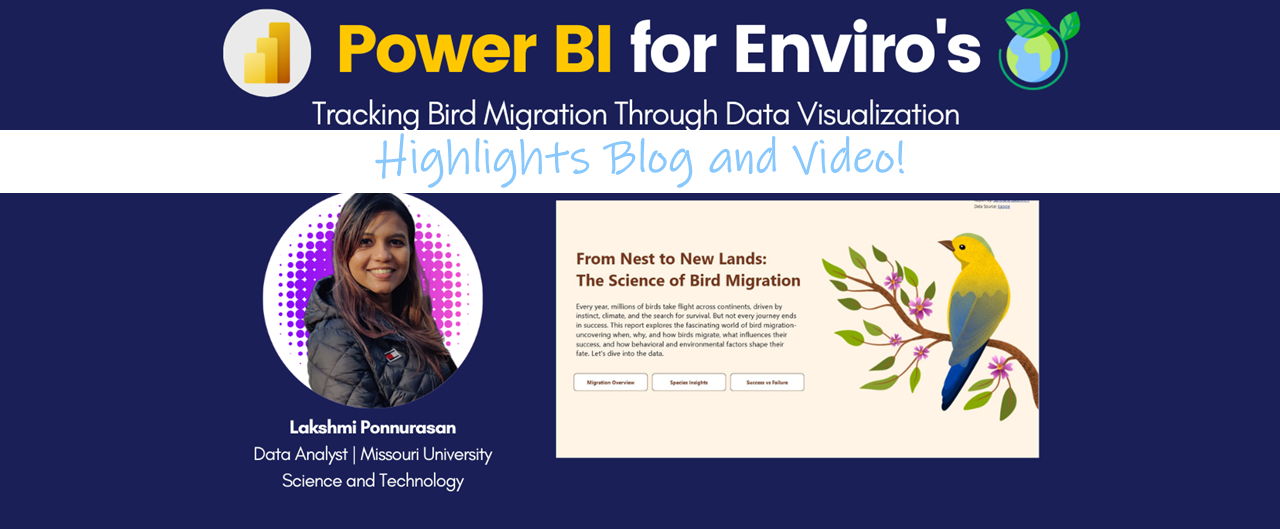
Create and embed a navigational video. You can only go so far with the instructional text-based prompts, and sometimes it is much easier to communicate how to navigate a dashboard with a short walk-through video to demonstrate the key features. An example of the navigational video we created for this study is below, and we have embedded the video directly into the dashboard home page using the HTML custom visual.

🎦 Check out the video 🎦
⭐ Tip 2: Use engaging visuals
The same data can be presented many different ways - but when you’re creating reports for the general public it becomes even more important to select visual representations which are both easy to understand and engaging. If the public aren’t engaged in the data, or it takes them too long to understand it, you will quickly lose them. In this study, the hero visual is definitely the interactive maps which present a snapshot of the water quality grade for various different parameters and time periods. Maps are a fantastic visual to quickly engage with the general public, as it provides the extra spatial context to make the data more meaningful and relevant, as well as being very quick for our brains to process (as opposed to presenting the data in a table format). And this dashboard has taken the maps to the next level of engagement using the following techniques:
Dynamic colours: Using conditional formatting to change the fill colour based on data (in this case the water quality grading). This allows the map to present not only the location, but a snapshot of the data.
Dynamic icons: Again, we have used conditional formatting to dynamically change the map point icon based on the parameter selected. Icons visually communicate another piece of information in addition to the location and colour (i.e. whether the grade score presented is for water clarity, algae, etc.)
On-hover tooltips: We have configured report page tooltips to provide even more information on-hover, for when the user is interested in a particular point.
The maps in the dashboard have all been created using the Icon Map custom visual (which we think is the BEST mapping visual available at the moment in Power BI).


⭐ Tip 3: Intuitive navigation
Just like the instructional prompts are key, it is also essential to layout your reports so that the navigation is intuitive and consistent. This helps the user to navigate through the dashboard in a logical manner (i.e. what pages to view in what order), but also allows you to embed a lot more information into the dashboard canvas by using buttons to show / hide different features. Some of our tips to creating an intuitive navigation experience are:
Page navigator: Use the new(ish) Page Navigator visual to create a button list of the pages in your report directly on the canvas so the users know what page they are currently on, and also help them to navigate the dashboard in a logical order. We often put this navigation panel across the top of the report or down the left hand side.
Bookmark navigator: If you have sub-pages within a given page (as we do on this dashboard), then you can create a similar navigational experience using the Bookmark Navigator visual. To use this visual effectively, create your bookmarks for the sub-pages (i.e. show / hide different visuals) and then organise these bookmarks into a group to allow you to easily manage and select the grouping for the bookmark navigator.
Reset / clear buttons: With public-facing reports it’s really important to provide users a ‘reset‘ or ‘return to default‘ button to allow them to reset the page if they have gotten themselves lost in a maze of slicers and visual interactions. You could do this either by using the new ‘clear slicers‘ action assigned to buttons (which only clears page slicers), or create a new bookmark to store the default state of the visuals and the data.
If you want to take the navigation experience to the next level, we’d recommend spending the time to change the default, on-hover, press and selected states of the buttons, consider the user of tooltips and also consider the use of icons to make the experience more engaging.

While we’ve just discussed our top 3 tips for creating public-facing Power BI reports, there are many more tips and tricks to consider such as:
Using report page tooltips to provide extra context
Use of images and icons to communicate at a glance
Use of conditional formatting to make the key data stand out
Align your report design with your organisations brand and style guide to promote trust and familiarity
Include accessibility features (i.e. colour selection, keyboard navigation, alt text, etc.) in your report to align with the Web Content Accessibility Guidelines
Review the dashboard visuals to ensure they render on all browsers, and have acceptable performance (i.e. rendering speed)
Use ‘Plain English‘ colloquial language and an ‘active‘ voice to make the dashboard engaging and easy to understand (marketing and comms teams are great for advice on this!)
User testing with a wide range of audiences before sharing with the general public
and the list goes on…
We hope this blog has been helpful and given you some tips and tricks to help bring your data to life and share it effectively with the general public!
💙 Connect
We'd love you to connect with the DiscoverEI team:
Email: info@discoverei.com
Website: https://www.discoverei.com/
Blog: https://www.discoverei.com/blog
YouTube: https://www.youtube.com/channel/UCFF5eaUsht-WzTdjEAgPDtQ
LinkedIn: https://www.linkedin.com/company/19050025/
Twitter: https://twitter.com/discover_ei
PowerBI4 Enviro's Meetup: https://www.meetup.com/en-AU/powerbi4enviros/
If you want to learn more about Power BI mapping visuals, then register for our Power BI 4 Enviro’s monthly meetup (https://www.meetup.com/en-AU/powerbi4enviros/), or if you’re keen on presenting at a future session then contact Christian (cborovac@discoverei.com).

Power BI Training Courses
If you’re interested in learning from our team, then we have a range of 2-day Power BI training courses available to fast-track your Power BI journey.
Click on the links below to learn more, and get in touch with the team today!


Do you want to learn how to design engaging and intuitive Power BI reports, which communicate your key insights at a glance and tell your data story?
Our two-day Power BI training course is designed specifically for Power BI Professionals and Data Analysts, and provides our best practice tips, tricks and hacks to help you transform your data! We provide this course online, in-person group sessions, or customised in-house training for your team. Places are limited (max 8 participants per class) so secure your spot today!