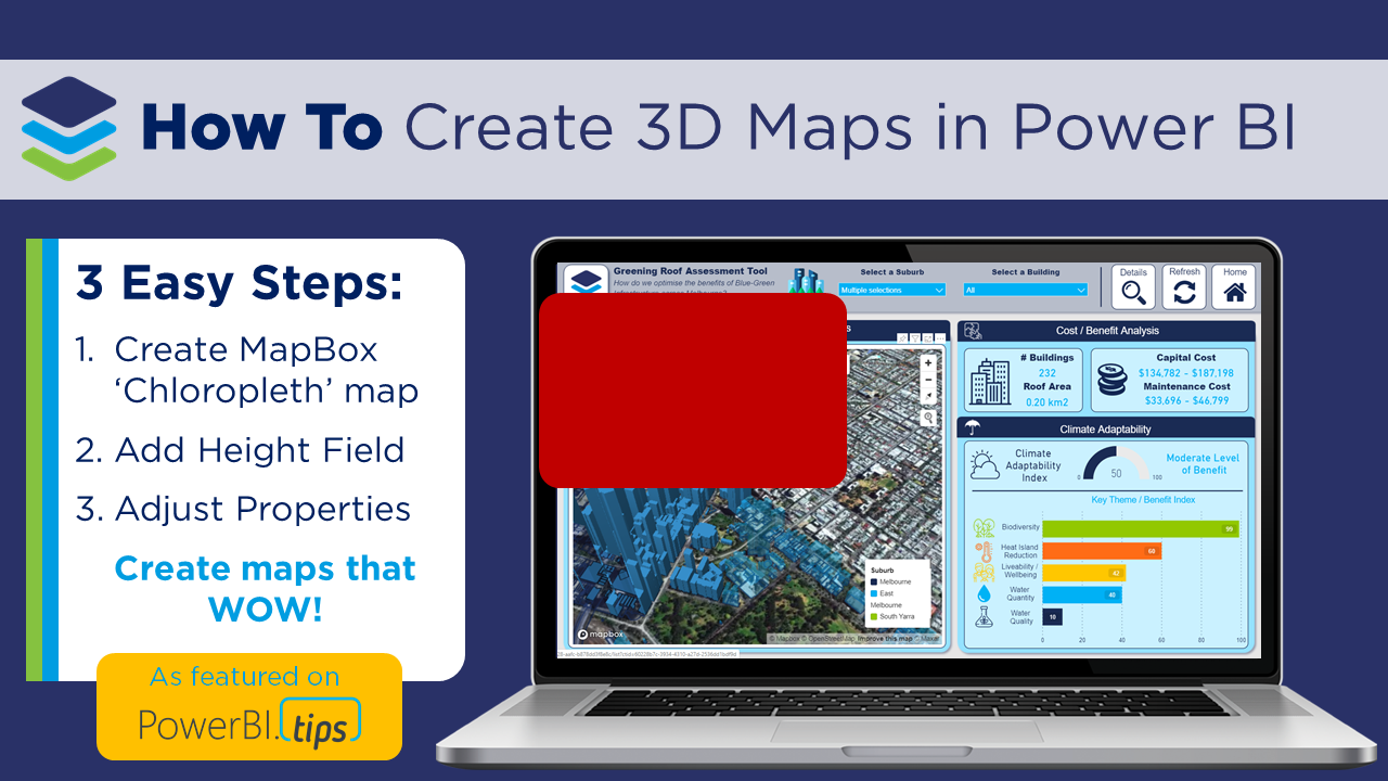
How to Create 3D Maps in Power BI
As featured HERE on PowerBI.Tips - the home of the best Power BI tips, tricks and resources!
🎦 Check out our short video tutorial to see all the details in action 🎦
If you’ve played around with MapBox in Power BI – you’ll know that it has loads of great features to create really rich and beautiful maps! And one of my favourite ways to get a new client excited about Power BI is to create an awesome 3D map of their city. Now, I know that 3D features get a bit of a bad wrap in traditional data viz circles (don’t even think about creating a 3D pie chart!!!), so why then are 3D maps different?
1. Greater context: We see our world in 3D, so when we transform a flat 2D map of our cities or mountains into a 3D map, it immediately creates greater connection and a sense of perspective.
2. Another dimension: 3D maps don’t just have to be based on ‘relative’ heights, you can use the 3D effect to add a new dimension to your visualisation, such as population per town, to communicate key insights at a glance.
3. They just look really fancy: Sometimes half our battle as data analysts revolves around getting people within our (or our clients) organisations engaged and connected to their data. Creating 3D maps can go a long way to get that ‘wow’ factor which gets people excited and interested in the data!


There are a couple of tricks to getting the 3D features working in MapBox, so in this video blog I walk through the key steps to help you create your own 3D maps using MapBox. If you’re new to MapBox, or need a bit of a refresher, I suggest checking out our MapBox for Power BI 101 Blog, first to learn about the fundamentals - then come back here to make some 3D maps 😀.
In our example, we create a 3D map of buildings across Melbourne as part of a ‘Green Roof’ assessment tool to help optimise the benefits of blue-green infrastructure across Melbourne. Note that we have anonymised this data and the calculations so that we can share it with the Power BI community (for demonstration purposes only!).
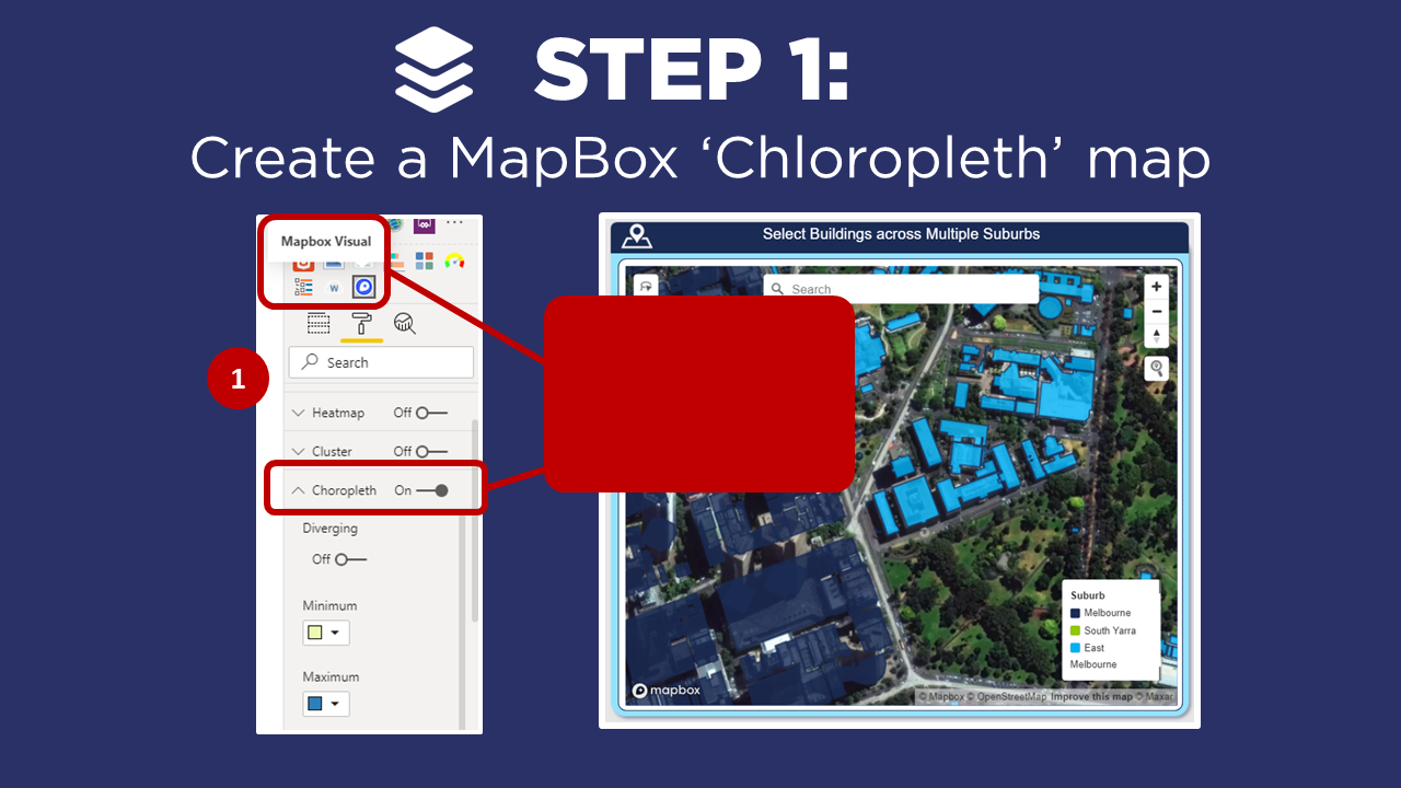
STEP 1: Add Chloropleth Map
▶️ Skip ahead in the video to Step 1▶️
The first step is to create a Chloropleth map, in Power BI using the MapBox visual. Now, there’s a couple of steps involved in getting to this stage - so if you’re new to MapBox, or just need a refresher on how to create a custom Chloropleth map, head across to our MapBox for Power BI 101 video blog where we walk through the key steps:
Add the MapBox custom visual into Power BI
Create a MapBox account and access token
Create a simple circle map (not required for 3D maps, but good to learn!)
Upload custom ‘tilesets’ to the MapBox Studio
Create a custom ‘Chloropleth’ map (just a fancy name for an area map…)
In our example, we have created a custom Chloropleth map of the building footprints across Melbourne, to allow our users to dynamically select different buildings to see the impacts of ‘greening the roof’ across a range of social and environmental benefits, as well as the indicative cost. However, for those who know the city, it would be a lot easier to get our bearings and recognise the buildings if we added their relative heights!
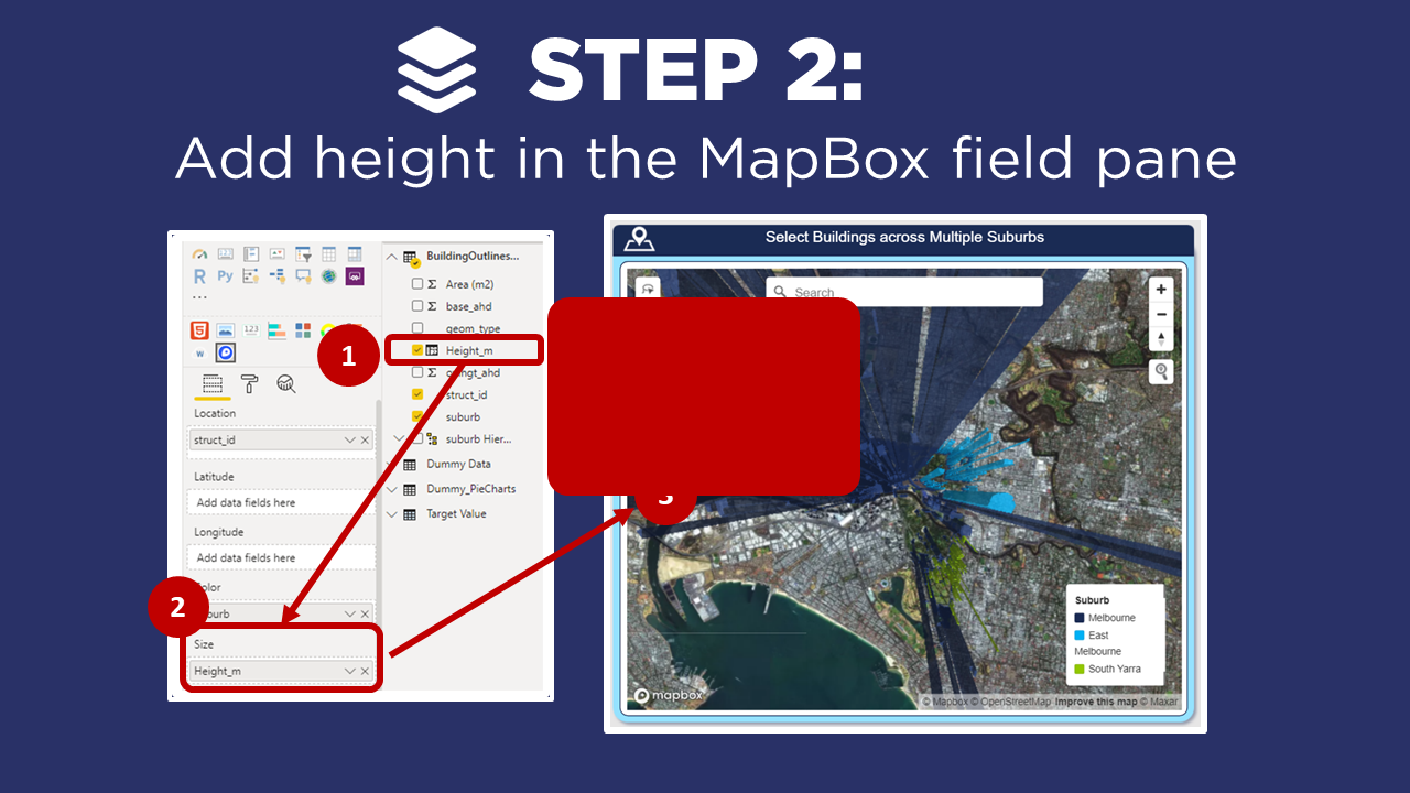
STEP 2: Add Height
▶️ Skip ahead in the video to Step 2 ▶️
Now that we have our Chloropleth map, the next step is to add a height field to the Size field well. In our example, I have calculated the height of each building using a simple DAX calculation, based on the attributes in my dataset. However, get creative with this - the size doesn’t have to be height, it’s simply another dimension to add to your visual. A couple of ideas to get you thinking:
Population per town
Amount of greenhouse gas emissions per building
Volume of water used per household
Now - this is where most people get a bit stuck! When we bring the size variable into the visual, given the default extrusion height is 500 (i.e. 500 x the size value), the extension of the different regions in your map can be HUGE! So jump down to Step 3 for a couple of tips to format your 3D map.
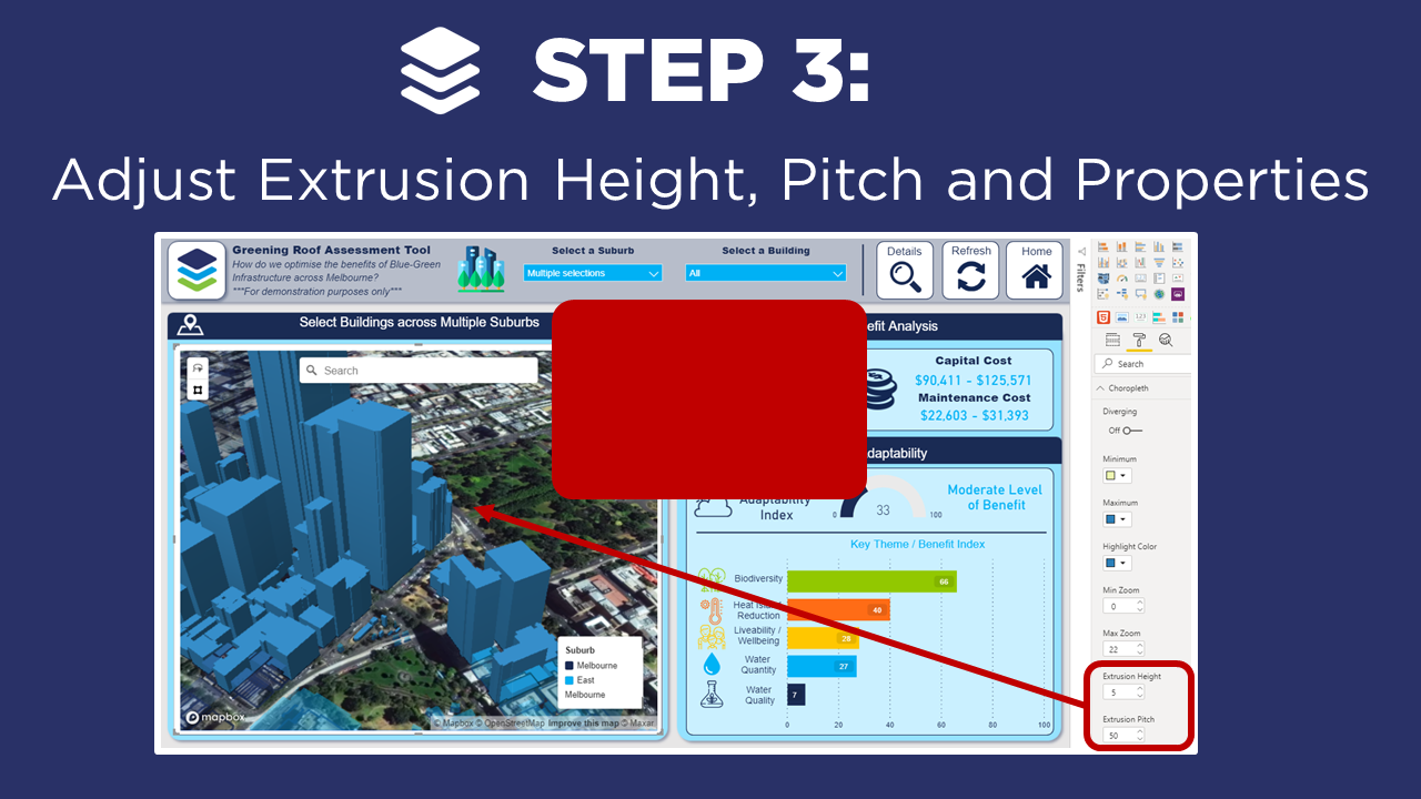
STEP 3: Adjust Formatting
▶️ Skip ahead in the video to Step 3 ▶️
To make our 3D map look awesome, we need to adjust the extrusion height, pitch and map properties. Watching the video for Step 3 is the best way to follow along, or for a quick refresher - see below:
Extrusion Height: Is the multiplication factor of our size variables to how far they extrude from the map. This factor will change based on the values in your dataset, so play around with it until you get it looking right - but chances are, the default value of 500 will be way too high!
Pitch: The pitch angle is used to change the map perspective, which is extremely important for 3D maps! Again, play around with this for your dataset. In our example, adjusting the pitch to 50 works really well to display the buildings more clearly, and easier to interpret the height variation across Melbourne.
Hint: Holding down on the Left Click button allows you to pan around your map, and when you hold CTRL + Left Click, you can dynamically change the perspective of your map which looks AWESOME when you have 3D elements!
Styles: Adjusting the map style allows you to change the underlying base layers. MapBox has some great default layers, and for this example we change from ‘outdoors‘ to ‘satellite‘, as it really helps provide context to recognise the key buildings.
Tip: To create you own Map Style for MapBox - stay tuned for our upcoming blog post!
Colours: You can also adjust the colours of your regions based on different attributes. In our example, we’ve adjusted the building colours based on suburb location. We can do this by dragging in the ‘suburb‘ dataset to the ‘data colours‘ field well - and adjusting the data colours under the format options.
In Summary…
And there you have it, by applying these 3 steps, we’ve now enhanced our MapBox visual by adding 3D layers.
If you’re interested in learning other ways to enhance your Power BI maps, then don’t forget check out the rest of our videos in this MapBox for Power BI series, where we go into some of the other really cool features of MapBox and show you how to get started quickly, create your own custom styles and backgrounds, and configure drill-down to reveal layers of insights.
How have you applied the MapBox visual in Power BI? Or do you have any questions, comments or new ideas for interesting blogs? Please post in the comments below - we’d love to hear from you!
Power BI Design Training Course
We’re really excited to announce DiscoverEI’s new Power BI training courses are now available! Get in touch today to learn more and secure your place!

Do you want to learn how to design engaging and intuitive Power BI reports, which communicate your key insights at a glance and tell your data story?
Our two-day Power BI training course is designed specifically for Power BI Professionals and Data Analysts, and provides our best practice tips, tricks and hacks to help you transform your data! We provide this course online, in-person group sessions, or customised in-house training for your team. Places are limited (max 8 participants per class) so secure your spot today!

Do you want to learn how to create interactive dashboards to assess environmental risks, analyse spatial and temporal trends in your datasets, and design infographic style environmental scorecards to visually communicate your findings to stakeholders and decision makers?
Our two-day Power BI training course is designed specifically for Environmental Professionals, to up-skill you quickly through hands-on exercises using examples with practical applications from across the environmental industry. We provide this course online, in-person group sessions, or customised in-house training for your team. Places are limited (max 8 participants per class) so secure your spot today!

Do you find yourself spending a lot of time manually cleaning and reviewing groundwater datasets, across multiple spreadsheets, only to repeat the same process next month?
Our two-day Power BI training course is designed specifically for Groundwater Professionals, to up-skill you quickly through hands-on exercises using examples which are directly relevant across the groundwater industry. We provide this course online, in-person open session, or customised in-house training for your team. Places are limited (max 8 participants per class) so secure your spot today!