
MapBox 101 for Power BI: How to Get Started!
As featured HERE on PowerBI.Tips - the home of the best Power BI tips, tricks and resources!

🎦 Check out our short video tutorial to see all the details in action 🎦
Maps are a fantastic way to communicate spatial data – and lucky for us Power BI has loads of awesome mapping visuals to choose from. However, the MapBox Custom Visual is definitely my favourite!
Why do I love it so much..?
It’s versatile: You can create pretty much any type of map you’d like, whether it be Circle, Heatmaps, Clusters, Chloropleths, Rasters…there’s plenty of options to choose from all in the one visual.
Ability to customise: Using the MapBox Studio, you can design and host your own spatial datasets, create custom base maps, and visualise them in Power BI.
But best of all… It’s free: Unlike the ArcGIS custom visual, where to unlock most of the cool features you need a paid ArcGIS online licence, you have access to all of MapBox’s amazing features with their free account.
But with so many features, I know that I was pretty overwhelmed when I was trying to get started. In this video blog I walk through the key steps to help you get started on your MapBox journey, from how to add the MapBox visual into Power BI, to getting set up with a MapBox account, and hosting your own custom files to create some really cool maps.
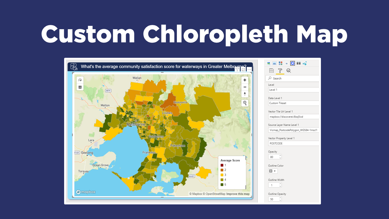
I’ll show you how to create both a circle map and a chloropleth (just a fancy word for area) map, using a ‘synthetic’ example I created to map the community satisfaction scores for waterways across Melbourne (where I live!).

If you’re keen to learn how to create really cool customised maps for your Power BI reports, then make sure to check out our other blogs in this 4-part MapBox series, where we explore how to create 3D maps, multi-layer drill downs, and design your own styles!
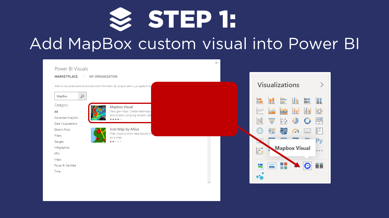
STEP 1: Add MapBox Custom Visual
▶️ Skip ahead in the video to Step 1▶️
To get started using MapBox, we first have to add it to our Power BI reports from the Microsoft AppSource. Unfortunately, MapBox is not a certified visual, so you may want to double-check within your organisation that there are no restrictions on using uncertified Custom Visuals.
Once you have the MapBox visual in your Power BI report, drag the visual onto your canvas, and then add either a location, or the latitude and longitude fields for your dataset. If you don’t have the Lat/Long projection type and you’re familiar with mapping software, then you should be able to make a conversion. Otherwise, the Engineering Toolbox online converter can help you out 👍!
In order to use the MapBox visual, we need to have a MapBox account and generate an Access Token…So let’s head to Step 2 to see how this works!
STEP 2: Set-up MapBox Account

▶️ Skip ahead in the video to Step 2 ▶️
We need a MapBox account, which literally takes one minute to sign up. This is where we can get our precious Access Token, but also the MapBox Studio where we can upload our custom Tilesets (Step 4) and the Styles gallery to make our own base maps (we’ll explore this a bit more in a future blog!).
When you have an account, copy your MapBox Access token from your account page. Then head back in Power BI, and we’re ready for Step 3!
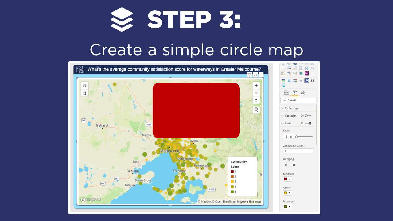
STEP 3: Create Circle Map
▶️ Skip ahead in the video to Step 3 ▶️
Now that we’ve copied our API token, lets paste it under the: Format Pane / Viz Settings. In our example this displays postcodes across Melbourne, represented by circles of the same size and colour.
The map at first glance looks quite simple and basic, but there are heaps of properties we can adjust and improve on, including:
Base Layer Style: MapBox has a lot of cool options to change our base layer, and in a future blog I’ll show you how to create your own custom styles.
Auto-Zoom Feature: Toggle this on for a cool auto-zoom to the selected data points. Note, if you’re interacting a lot with your map - this feature could get a bit distracting (so worth switching it off). But if you just have a few areas where you can select, or you’re looking to impress some people new to MapBox - this always does the trick!
Circle Colours: Play around with the circle colours to provide some nice contrast in the default colour, the highlight colour, or even a dynamic colour scale based on another attribute. In our example we adjust the colour based on the community satisfaction score of the various waterways (calculated using a Power BI DAX Measure).
Titles and Borders: Useful to provide context on your map, and frame it in your report.
Now given MapBox has 5 different map types to choose from (heat, circle, cluster, raster and chloropleth), it’s really important to select the right map type to suit your data. In our example, these points actually represent postcodes, which would be much better to display as area regions (or polygons). And we can do that too in MapBox by creating a chloropleth map (just a fancy word for an area map) with our own custom tilesets… So let’s head to Step 4.
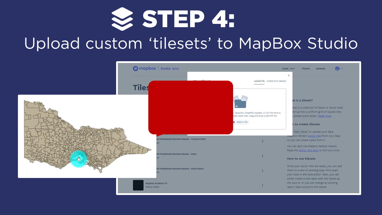
STEP 4: Add Custom Tileset
▶️ Skip ahead in the video to Step 4 ▶️
Now before we jump in, let’s clarify a bit of jargon - what exactly is a MapBox tileset? A tileset is simply a collection of spatial data (i.e. Shapefiles (.shp format), GeoJSON files, Rasters, etc.) which can be styled for different zoom levels. Learn more here.
To get started, we first need a spatial file. In our example, I have downloaded a Shapefile of polygons of post codes across Victoria from the Spatial Datamart, which provides loads of open source spatial datasets. It’s likely that your own state or country have publicly available spatial files too, which can help get you started. Or if you want to create your own, tools like QGIS are fantastic. Check out Steps 1 and 2 of this Blog for details.
To import a shapefile into MapBox, zip it up with supporting files, and upload this as a new tileset in the MapBox Studio using the account we set-up in Step 2.
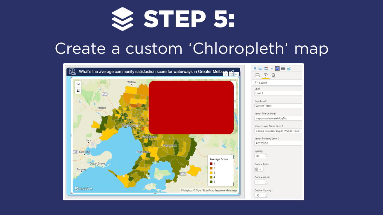
STEP 5: Create Chloropleth Map
▶️ Skip ahead in the video to Step 5▶️
Now for the really fun part - building our chloropleth or area map 🗺️. There are a few steps here including:
Click on the map visual in Power BI, and remove the Lat/Long fields;
We want to add Postcode into our location field;
We next head across to the Format pane and make the all important selection to change from Circle Map, to a Chloropleth Map;
Under Format Settings, lets change the tileset from default, to our custom tileset we developed in Step 4;
There are three key pieces of information we need to include which can all be found within the MapBox Studio: Vector Tile URL; Source Layer Name; and the Field Name.
Hint: Watch the video for step-by-step guide on where to find this information.
And that is it! You now know the basics to help you get started on your MapBox journey in Power BI, from setting up an account, creating a simple circle map to a fully customised chloropleth map!
If you enjoyed this introductory MapBox post, and want to now learn how to style your maps, create 3D maps and also the ability to configure interactive drill-down maps - then be sure to check back in over the next few weeks!
In Summary…
By applying these 5 steps, we’ve created our own custom MapBox visual in Power BI.
Head across to the Power BI Data Stories Gallery to play around with our Power BI report for yourself!!

How can you apply the MapBox visual to show data in your own Power BI projects?
Please post in the comments below - we’d love to hear from you!
Power BI Design Training Course
We’re really excited to announce the DiscoverEI teams virtual 2-day Power BI training courses, to fast-track your Power BI journey. Click on the links below to learn more, or get in touch today!
Purchase Training


Do you want to learn how to design engaging and intuitive Power BI reports, which communicate your key insights at a glance and tell your data story?
Our two-day Power BI training course is designed specifically for Power BI Professionals and Data Analysts, and provides our best practice tips, tricks and hacks to help you transform your data! We provide this course online, in-person group sessions, or customised in-house training for your team. Places are limited (max 8 participants per class) so secure your spot today!