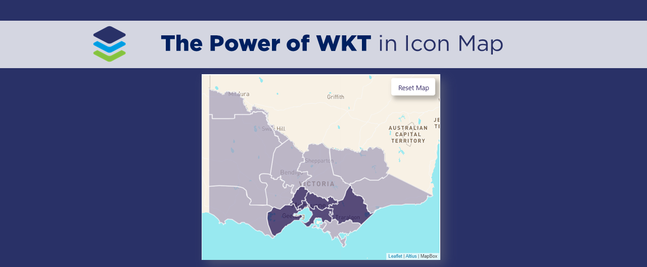
The Power of WKT in Icon Map
Working across the environmental industry – it’s fair to say that pretty much ALL of DiscoverEI’s Power BI reports have a map! And if you thought that MapBox was good, well you’re going to LOVE the Icon Map custom visual in Power BI – which allows you to display interactive polygons, points, lines and of course – icons, all in the one visual…plus so much more!
In this video blog we walk through how to take Icon Map to the next level by incorporating WKT to plot custom points, lines and polygons, including a quick overview of how to convert your spatial files to WKT in QGIS. A big shoutout and thanks to James Dales for creating this awesome visual!! James is always making updates and enhancements to the visual so the best place to get the latest version and some helpful instructions and tips on how to use it is from his dedicated website: https://icon-map.com/index.html. And while you’re there remember to shout James a coffee or 10 to say thanks for creating such a fantastic mapping visual 😀
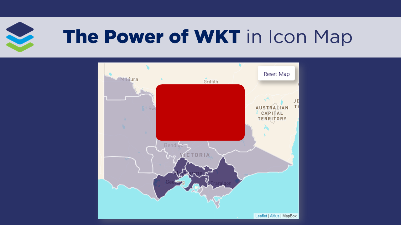
🎦 Watch the video blog here 🎦
If you’re keen to learn more about how you can create your own Icon Maps in Power BI, then be sure to check out our Icon Map video blogs where we’ll be exploring real-world applications, creating a simple Icon Map, creating an icon Map using custom WKT and integrating MapBox and Icon Map to design custom base-maps.
Have fun creating your own Icon Maps and thanks for watching!
Power BI Training Courses
If you’re interested in learning from our team, then we have a range of 2-day Power BI training courses available to fast-track your Power BI journey.
Click on the links below to learn more, and get in touch with the team today!
Do you find yourself spending a lot of time manually cleaning and reviewing groundwater datasets, across multiple spreadsheets, only to repeat the same process next month?
Our two-day Power BI training course is designed specifically for Groundwater Professionals, to up-skill you quickly through hands-on exercises using examples which are directly relevant across the groundwater industry. We provide this course online, in-person open session, or customised in-house training for your team. Places are limited (max 8 participants per class) so secure your spot today!
Would you like to learn how to develop interactive water management reporting tools and online dashboards to help foster a culture of data driven decision making across your organisation?
Our two-day Power BI training course is designed specifically for the Water Industry, to up-skill you quickly through hands-on exercises using examples which are directly relevant to water professionals. We provide this course online, in-person open session, or customised in-house training for your team. Places are limited (max 8 participants per class) so secure your spot today!
Do you want to learn how to create interactive dashboards to assess environmental risks, analyse spatial and temporal trends in your datasets, and design infographic style environmental scorecards to visually communicate your findings to stakeholders and decision makers?
Our two-day Power BI training course is designed specifically for Environmental Professionals, to up-skill you quickly through hands-on exercises using examples with practical applications from across the environmental industry. We provide this course online, in-person group sessions, or customised in-house training for your team. Places are limited (max 8 participants per class) so secure your spot today!
Related Posts
Interactive dynamic reference layers are now possible in the Azure Map core visual for Power BI! In this short video blog, Alice walks through this new feature (released Oct 2024), how to configure them in your Azure map and several ‘Gotchas‘ to be aware of in the first release of this feature! I hope this helps you have fun exploring maps in Power BI.
Icon Map Pro is the new and improved version of Icon Map, which has loads of new features and even more mapping capability! Like the original Icon Map, the Icon Map Pro includes the ability to connect to a WMS hosted spatial layer, allowing you to visualise highly detailed raster datasets really quickly and easily. In this video blog I walk through the steps to connect to existing WMS layers in Icon Map Pro using the publicly available NSW Koala Tree Indices dataset so you can follow along at home. I hope this helps you have fun exploring maps in Power BI!
The amazing free Icon Map custom visual for Power BI has the ability to display dynamic WMS layers, allowing you to visualise highly detailed raster datasets really quickly and easily. In this video blog I walk through the steps to connect to existing WMS layers in Icon Map using the publicly available NSW Koala Tree Indices dataset so you can follow along at home. I hope this helps you have fun exploring maps in Power BI.
This blog post unpacks several considerations for when⚠️ NOT to use Power BI ⚠️ to create public engagement and communication tools. This is based on our recent experience working collaboratively with Charles Sturt University (CSU) to create a custom scripted public-facing online interactive tool to help communicate river and environmental flow data, and fish survey results across the Edward/Kolety-Wakool River system in southern New South Wales.
Displaying very detailed spatial files using WKT in the Icon Map comes with it’s challenges – the biggest being poor performance (i.e. very slow to render). Some simplification and reduction of precision can go a long way In this video blog I walk through some of my tips to simplify and reduce precision of your spatial files (using free tools such as QGIS and Map Shaper) BEFORE importing into Power BI as a WKT file to really improve rendering speed and avoid exceeding the 32,766 text character limit in Power Query. I hope this helps you have fun exploring maps in Power BI.
Sometimes we want to display highly detailed spatial files in Power BI using WKT text strings in the Icon Map custom visual… BUT Power Query has a text character limit of 32,766 characters per data point - so what can we do?!? In this video blog I walk through some Power Query and DAX magic to split up our WKT text string and then stitch it back together using CONCATENATEX. I also go over a very frustrating ‘gotcha’ where Power BI removes the lagging spaces in our text string on import (which causes errors in our WKT file) and how to resolve it. I hope this helps you have fun exploring maps in Power BI.
In this blog video I share a universal Power Query script for converting point data from easting/northing to latitude/longitude, which allows us to use this data in our Power BI mapping visuals.
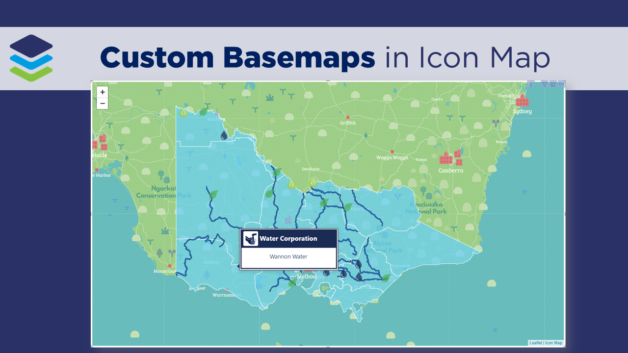
In this short video blog we walk through how to create custom basemaps in MapBox and integrate them into your Icon Map in Power BI! We then take it to the next level by configuring dynamic basemaps which we can change using slicers. A big shoutout and thanks to James Dales for creating this awesome visual!!
In this short video blog we walk through how to take Icon Map to the next level by incorporating WKT to plot custom points, lines and polygons, including a quick overview of how to convert your spatial files to WKT in QGIS. A big shoutout and thanks to James Dales for creating this awesome visual!!
Icon Map is hands down my favourite mapping visual for Power BI! In this short video I walk through how to get started creating your very first map with custom icons. A big shoutout and thanks to James Dales for creating this awesome visual!!
Do you want to learn how to design engaging and intuitive Power BI reports, which communicate your key insights at a glance and tell your data story?
Our two-day Power BI training course is designed specifically for Power BI Professionals and Data Analysts, and provides our best practice tips, tricks and hacks to help you transform your data! We provide this course online, in-person group sessions, or customised in-house training for your team. Places are limited (max 8 participants per class) so secure your spot today!