
How to Create Drill Down Maps in Power BI
As featured HERE on PowerBI.Tips - the home of the best Power BI tips, tricks and resources!

🎦 Check out our short video tutorial to see all the details in action 🎦
If you’ve played around with MapBox in Power BI – you’ll know that it has loads of great features to create really rich and beautiful maps! One feature I love is the ability to ‘drill down’ to dynamically uncover different layers of your spatial data hierarchy, just in the same way that you can drill down on a standard column chart or matrix in Power BI.
But why would we want to drill down on a map?
See the big picture: Using drill down, we can visualise the dataset at the ‘big picture’ scale, and then explore finer details for areas of interest (just think of the classic spatial hierarchy of Country à State à City à Suburb)
Save on real estate: We can also display multiple datasets at different levels in the same map – which goes a long way to conserving your precious report page real estate by reducing the number of visuals in your report!
Performance: Following on from above, less visuals almost always equates to better report performance! And this is especially true when using MapBox, which is at the slower end of the Power BI performance scale at the best of times – so using drill down to reduce the number of maps combined with filtering your datasets goes a long way to speeding up your reports!
Setting up a drill down map in MapBox is pretty simple once you get the hang of configuring Chloropleth maps,
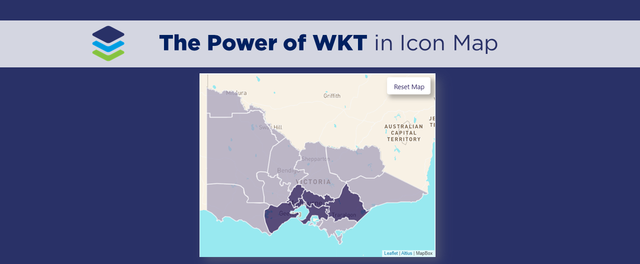
In our example, we create a drill down map of priority Catchments and Rivers across Victoria using ‘synthetic’ data, which I created to visualise the nutrient concentration over time (for demonstration purposes only!).
STEP 1: Add Chloropleth Map

▶️ Skip ahead in the video to Step 1▶️
The first step is to create a Chloropleth map, in Power BI using the MapBox visual. Now, there’s a couple of steps involved in getting to this stage - so if you’re new to MapBox, or just need a refresher on how to create a custom Chloropleth map, head across to our MapBox for Power BI 101 video blog where we walk through the key steps:
Add the MapBox custom visual into Power BI
Create a MapBox account and access token
Create a simple circle map (not required for drill-down maps, but good to learn!)
Upload custom ‘tilesets’ to the MapBox Studio
Create a custom ‘Chloropleth’ map (just a fancy name for an area map…)
In our example we have created a custom Chloropleth map to visualise the priority rating of catchments across Melbourne. While this provide a pretty good overview, we could add a lot more context to this visual by providing the ability to drill down deeper, and identify the priority rating on individual rivers, rather than entire catchments.
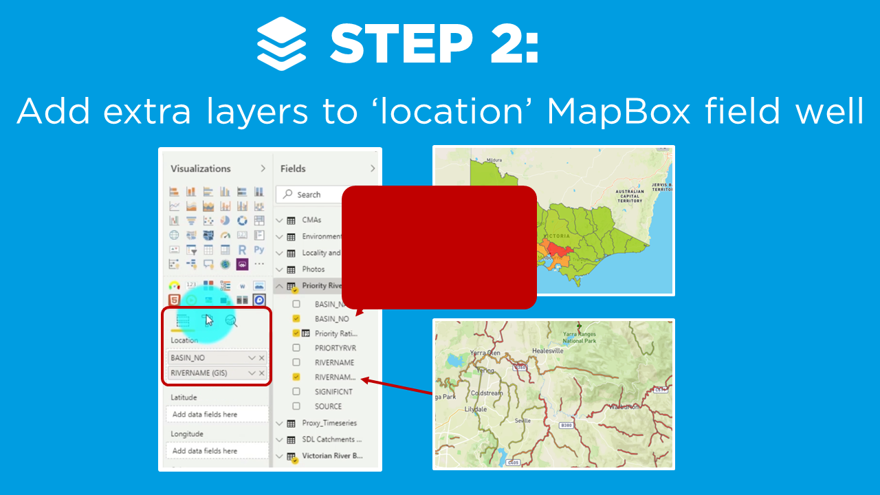
STEP 2: Add Layers
▶️ Skip ahead in the video to Step 2 ▶️
Our second step is to add another layer to the ‘location field‘ of our MapBox visual. This is similar to how we add multiple fields into matrix or chart visuals to create our hierarchy.
In our example, the first layer in our hierarchy is our Basin.
We can simply drag in our Rivers as the second level in our field well.
Under the ‘format pane‘ options for the ‘Chloropleth’ map, we then increase the number of levels to 2.
Note: MapBox allows you to add up to 5 levels in your hierarchy!
And then we edit the properties of each level just as we usually would when creating a Chloropleth map.
Let’s head down to Step 3 to find out more!
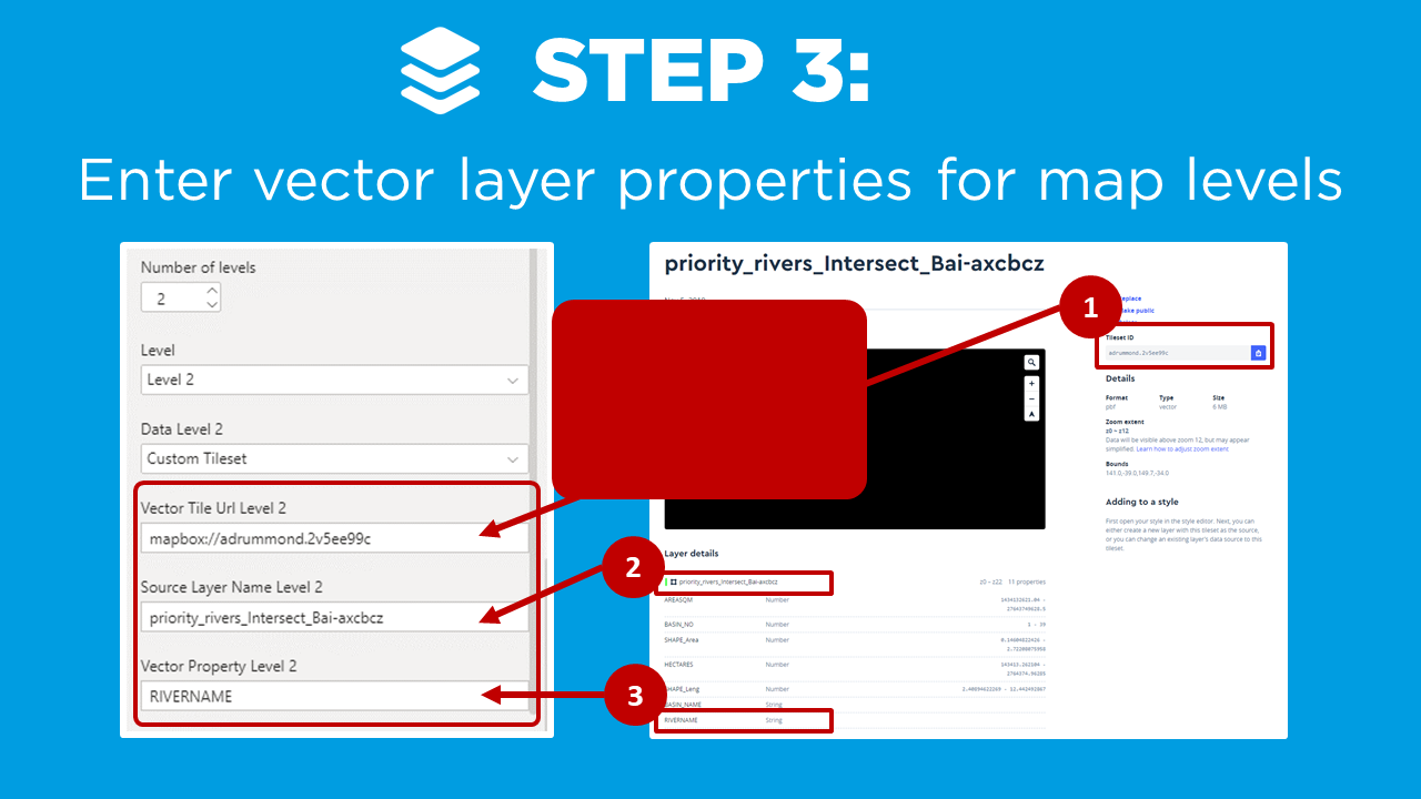
STEP 3: Layer Properties
▶️ Skip ahead in the video to Step 3 ▶️
To make our map look awesome and allow for the drill down, we need to configure some layer properties for the Rivers we’ve just brought in (i.e. Level 2). This is highlighted clearly in the video (above), and key steps are summarised below:
Head back to the MapBox Studio
Upload your custom Tilesets (for each level of your hierarchy)
Copy the ‘Tileset ID’ and paste this as the URL for corresponding level in the MapBox visual
Repeat the same process for the ‘Source Layer Name’, and the ‘Vector Property’
Last step is to activate the drill down functionality in the MapBox visual in Power BI (just as you would any other visual). In Power BI we select the MapBox visual and click ‘drill down‘ on in the top right corner.
We can now click on a Level 1 catchment, and drill down into Level 2 and see the priority rivers…..pretty cool yeah?
Note: You can also expand the hierarchy across all catchment level by clicking the ‘expand all‘ feature in the top right corner - super useful 😀.
In Summary…
And there you have it, the tips and tricks for developing 3D maps using MapBox. By applying these 3 steps, we’ve now enhanced our MapBox visual by adding the drill down feature and revealing more insights into the data!
If you’re interested in learning other ways to enhance your Power BI maps, then don’t forget check out the rest of my videos in this MapBox for Power BI series, where we go into some of the other really cool features of MapBox and show you how to get started quickly, create your own custom styles and backgrounds, and build 3D maps.
How can you apply the MapBox visual to show data in your own Power BI projects?
Please post in the comments below - we’d love to hear from you!
Power BI Training Courses
We’re really excited to announce the DiscoverEI teams virtual 2-day Power BI training courses, to fast-track your Power BI journey. Click on the links below to learn more, or get in touch today!
Purchase Training


Do you want to learn how to design engaging and intuitive Power BI reports, which communicate your key insights at a glance and tell your data story?
Our two-day Power BI training course is designed specifically for Power BI Professionals and Data Analysts, and provides our best practice tips, tricks and hacks to help you transform your data! We provide this course online, in-person group sessions, or customised in-house training for your team. Places are limited (max 8 participants per class) so secure your spot today!