
How to Create Context in Power BI Using Tooltips

🎦 Check out our short video tutorial to see all the details in action 🎦
Today we are going to explore the world of report page tooltips (RPTT) and learn how we can use these Power BI gems to maximise our dashboard real estate and present relevant information when the user needs it.
3 Reasons to love RPTT:
They provide additional context without taking up precious report real-estate
Users love the surprise and novelty factor of having a RPTT pop-up when hovering over a visual
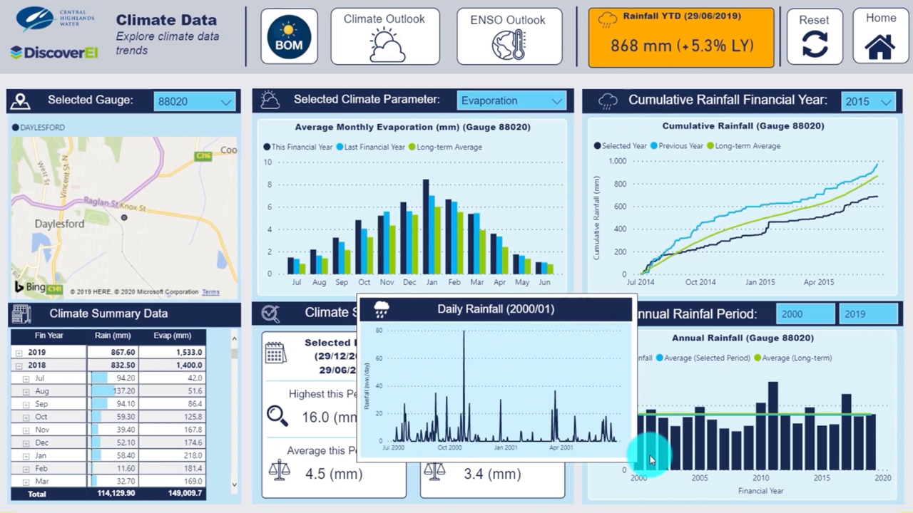
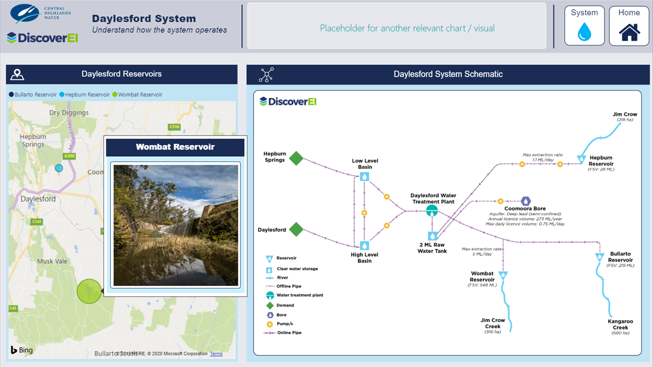
You can build almost anything into a RPTT, including gauges, custom visuals or images (check out some examples in our video for inspiration!)
In this post we walk through how to create report page tooltips and add them into your visuals and headers
This post is part of our blog series where we unpack our demo dashboard we developed using publicly available data for Melbourne’s Healthy Waterways Strategy. To see the whole dashboard in full - check our our Top 5 Dashboard Design Tips Post.
As always, our written blog provides a quick summary of the key steps. Make sure to watch the videos as visual design is meant for viewing - not reading!!!
STEP 1: Create a Tooltip Page
▶️ Skip ahead in the video to Step 1 ▶️
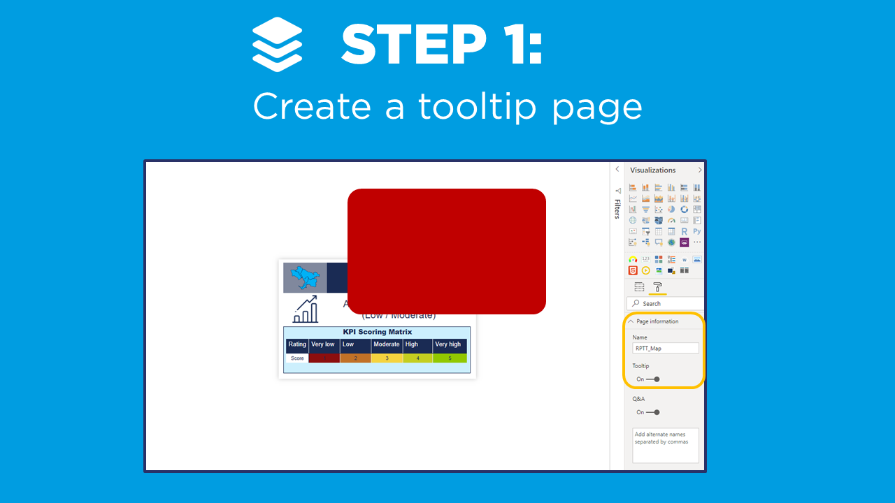
The first step is to create a Report Page Tooltip Page. Unlike other pages in our Power BI report, our users won’t interact with the tooltip pages directly. The purpose of tooltip pages are to provide a snapshot of supporting information, based on the given context of our selected visual in our master report page. There are loads of great videos out there to get you started (check out the Guy in a Cube’s How To Video).
Configuring tooltip pages can take a bit of getting used to, as there is no filter context - so we recommend starting simple, and then layering up the formatting once it’s all working.
The key steps are:
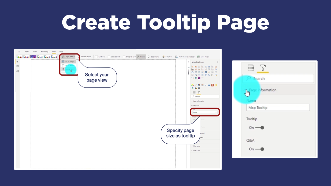
Adjust the page size. Either use the default tooltip page size, or your own custom size. Just remember that tooltip pages should be small (so they don’t go over the edges of the report canvas). It’s a good idea to change the Page View to Actual Size to see how big your tooltip page really is.
Define as Tooltip: under Format / Page Information option, turn Toggle Tooltip to on
Hide Page: so that users can’t interact with it
Add measures: start simple by dragging some measures (I like to use Card visuals) onto the canvas to check how the context updates and how the visual will look.

STEP 2: Assign Tooltips to Visuals
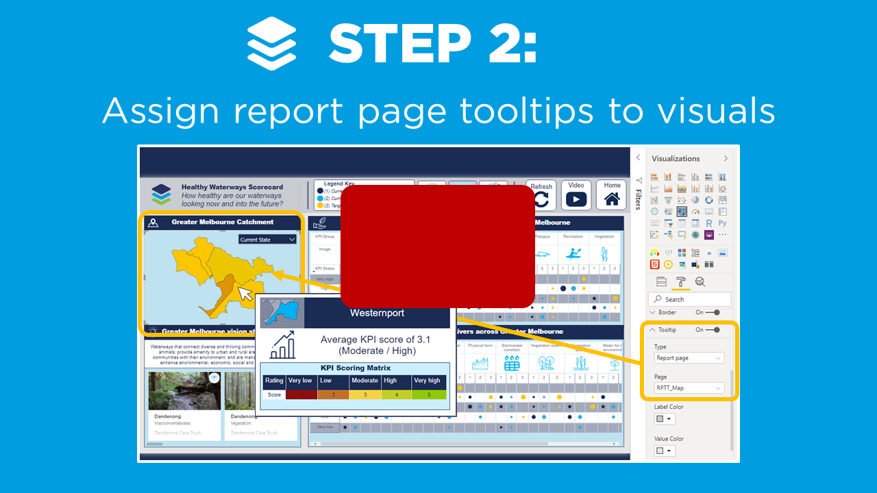
▶️ Skip ahead in the video to Step 2 ▶️
The next step is to assign our report page tooltips to visuals:
Head back over to your main report page and select a visual to add your tooltip page to
Navigate to Format and Tooltip (toggle on), then define Type: Select Report Page and choose Page: Select your report page
Now when you hover over your visual, you should see your report page tooltip update based on the given context.
When your tooltip page is working - it’s time to get creative with the formatting! A few of our favourite tricks are:
Leave some white space between your visuals and the edge of the tooltip page - this padding makes your tooltip page really stand out when it’s viewed on top of the other visuals in your report page. If you’re feeling adventurous, try creating a custom background for your tooltip page to really take it to the next level!
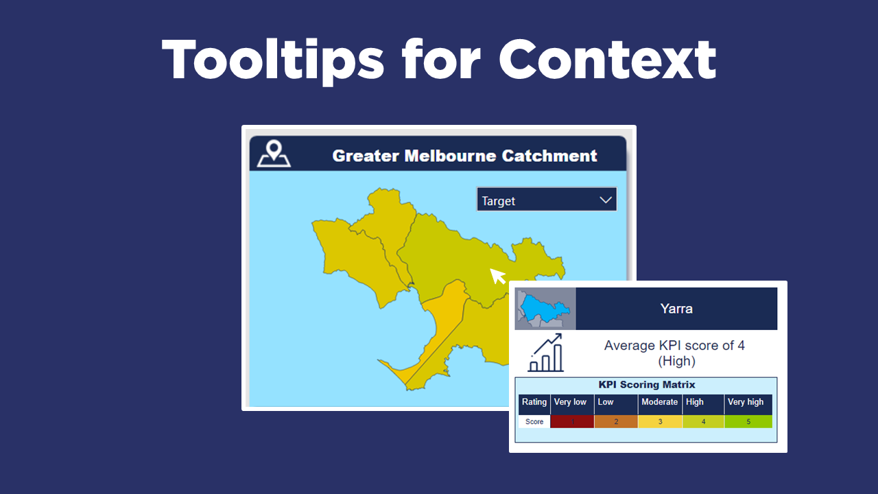
Use icons, images and colour to quickly communicate the key messages at a glance
Make sure that all visuals and data fits on the page, and wrap text! (remember - there’s no scrolling option for tooltips!)


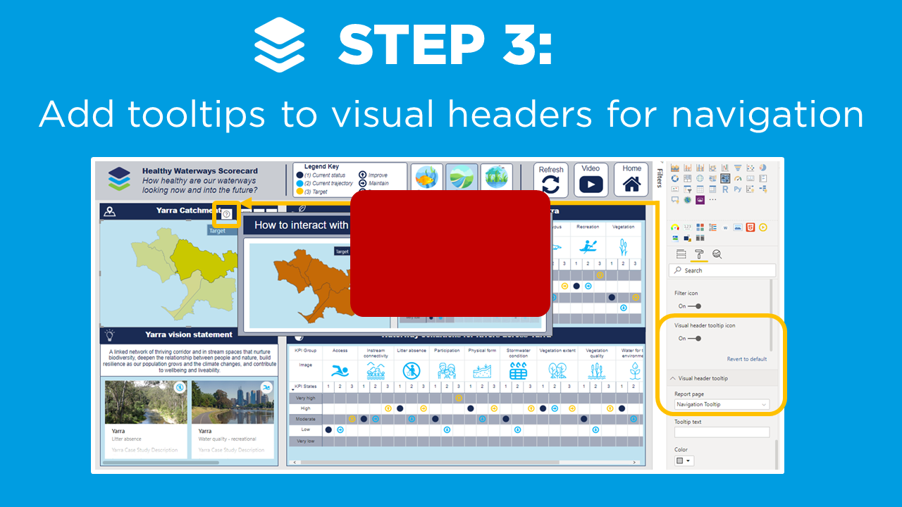
TIP 3: Tooltips in Headers!
▶️ Skip ahead in the video to Step 3 ▶️
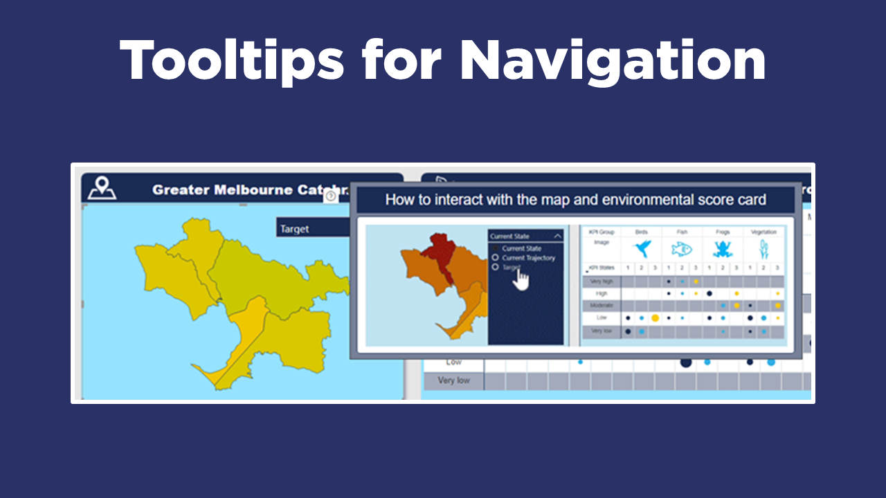
As of the June 2019 Power BI update - we can now add report page tooltips to our visual headers. This is a great way to provide our report users lots of great info on what the visual is showing, or even how to navigate different visuals. Remember - dashboard design is all about making things more intuitive for your users!
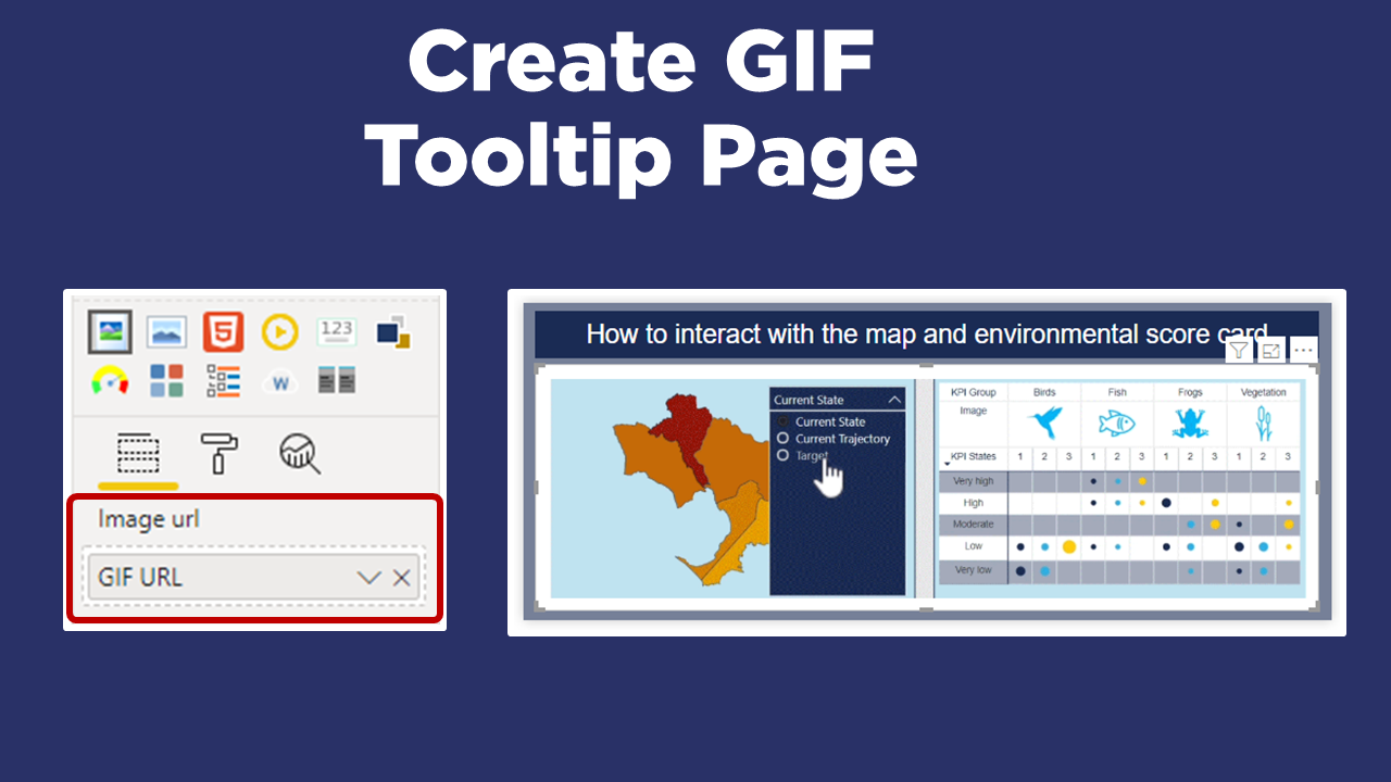
Probably the best example of visual header tooltips which we’ve come across recently is in the New Sales and Returns Sample Report which Chris Hamill and Miguel Myers released in December 2019 (Check it our here), where they have embedded GIFs in the tooltip pages to help users navigate different visuals. We were so inspired that we decided to unpack their example and create our own!
The key steps are:
Configure a tooltip page (as usual)
Embed a GIF (we used the Image custom visual). We’ve got a whole other blog post coming up on how to create, host and embed GIFs into Power BI reports - so stay tuned!
Select your main visual in your report page, and under the Visual Header formatting options, toggle on the Visual Header Tooltip Icon, and select your tooltip page
Now when we hover over our visual you can see the new question mark icon appear in the header. And hovering over this question mark brings up our tooltip page with our animated GIF to show users how to navigate the report.
Beware - it can be tricky for users to actually find the question mark icon in the first place… let alone know that they’re meant to hover over it…! So keep this in mind when designing and rolling out your reports. But I think that visual header tooltips, if done right, have a lot of potential to make your reports a lot more user friendly and easier to understand.

Tooltip Gallery
If you’re looking for some Tooltip Inspiration - you’re in luck, because we are obsessed with them!
Check out our gallery below, or head across to our YouTube channel for loads of Power BI example reports.


In Summary…
By applying our 3 simple steps for applying tooltips, you can provide your users with greater context on the dashboards, and make them more intuitive to navigate across.
Head across to the Power BI Data Stories Gallery to play around with our Power BI report for yourself!!

Do you have your own ideas or tricks on how to apply tooltips? Or have any questions, comments or suggestions for future blog post…?
Please post in the comments below - we’d love to hear from you!
Power BI Training Courses
We’re really excited to announce the DiscoverEI teams virtual 2-day Power BI training courses, to fast-track your Power BI journey. Click on the links below to learn more, or get in touch today!
Featured


Do you want to learn how to design engaging and intuitive Power BI reports, which communicate your key insights at a glance and tell your data story?
Our two-day Power BI training course is designed specifically for Power BI Professionals and Data Analysts, and provides our best practice tips, tricks and hacks to help you transform your data! We provide this course online, in-person group sessions, or customised in-house training for your team. Places are limited (max 8 participants per class) so secure your spot today!