How to calculate species abundance and richness in Power BI using DAX
This part of DiscoverEI's DAX for Enviro's series, where we explore how to calculate species richness and abundance in Power BI using the DAX functions SUM and DISTINCTCOUNT. Watch the video to learn about how to apply these DAX functions and play around with the Power BI report that we created in the video, embedded below.
The Scenario:
Let's imagine that I am an ecologist who is completing an ongoing fauna survey, and I want to track both the species richness (how many different types of species were there?) and also the species abundance (how many individuals did we observe per species?). I've imported my data into Power BI... but where do I start?
DAX Magic:
Introducing DAX aggregators! Aggregators allow us to easily aggregate our data, whether it be the count, sum, average, min, max.... We'll start by exploring the simplest DAX function SUM to calculate species abundance:
Species abundance = SUM('Fauna Observations'[Number of observations])
And then we'll explore the DISTINCTCOUNT function to calculate species richness:
Species richness = DISTINCTCOUNT('Fauna Observations'[Scientific name])
Learn more about DAX aggregators on the Microsoft DAX Docs here.
🎦 Check out the video 🎦
Recommended DAX Resources
As mentioned in the recording there are some AMAZING resources out there to help you with your DAX journey. Here is our pick of the bunch:
Power BI Docs: https://docs.microsoft.com/en-us/dax/dax-overview
DAX Guide: https://dax.guide
SQL BI: https://www.sqlbi.com/
RADACAD: https://radacad.com/new-video-course-dax-and-calculations-in-power-bi
Matt Allington: https://exceleratorbi.com.au/blog/
Chris Webb: https://blog.crossjoin.co.uk/
DAX Formatter: https://www.daxformatter.com/
DAX Studio: https://daxstudio.org/
DAX.Do: https://dax.do/
If you have an environmental DAX challenge that you’d like us to tackle in a future video then please write in the comments below or email the team at info@discoverei.com
Power BI Training Courses
If you’re interested in learning from our team, then we have a range of 2-day Power BI training courses available to fast-track your Power BI journey.
Click on the links below to learn more, and get in touch with the team today!
Do you find yourself spending a lot of time manually cleaning and reviewing groundwater datasets, across multiple spreadsheets, only to repeat the same process next month?
Our two-day Power BI training course is designed specifically for Groundwater Professionals, to up-skill you quickly through hands-on exercises using examples which are directly relevant across the groundwater industry. We provide this course online, in-person open session, or customised in-house training for your team. Places are limited (max 8 participants per class) so secure your spot today!
Would you like to learn how to develop interactive water management reporting tools and online dashboards to help foster a culture of data driven decision making across your organisation?
Our two-day Power BI training course is designed specifically for the Water Industry, to up-skill you quickly through hands-on exercises using examples which are directly relevant to water professionals. We provide this course online, in-person open session, or customised in-house training for your team. Places are limited (max 8 participants per class) so secure your spot today!
Do you want to learn how to create interactive dashboards to assess environmental risks, analyse spatial and temporal trends in your datasets, and design infographic style environmental scorecards to visually communicate your findings to stakeholders and decision makers?
Our two-day Power BI training course is designed specifically for Environmental Professionals, to up-skill you quickly through hands-on exercises using examples with practical applications from across the environmental industry. We provide this course online, in-person group sessions, or customised in-house training for your team. Places are limited (max 8 participants per class) so secure your spot today!
Related Posts
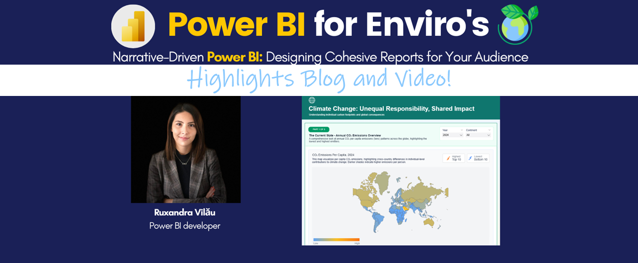
In this session, Ruxandra showcased the importance of structuring a Power BI report around a clear, audience-centered narrative rather than a collection of disconnected visuals. Using her "Climate Change - Unequal responsibility, Shared impact" Power BI report as an example (available here: https://community.fabric.microsoft.com/t5/Contests-Gallery/Week-2-Climate-Change-Unequal-Responsibility-Shared-Impact/m-p/4927475#M2798), we explored the storytelling challenge of working with metrics at different granularities.
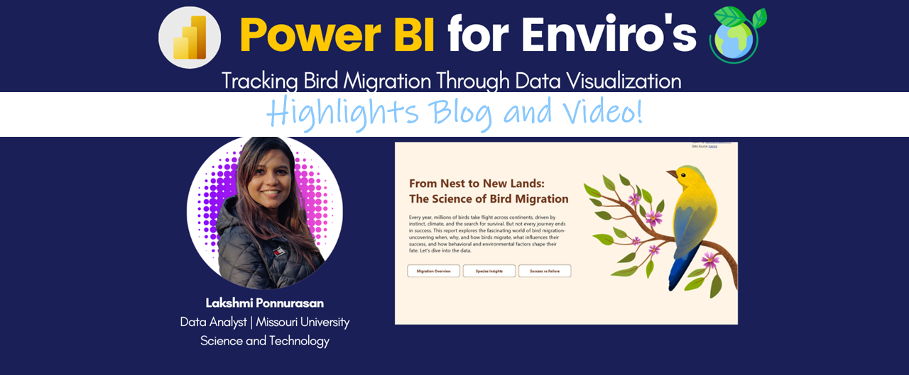
In this session, Lakshmi Ponnurasan explained to us the thoughts and design behind her Global DataViz World Championship winning entry for her Bird Migration report.
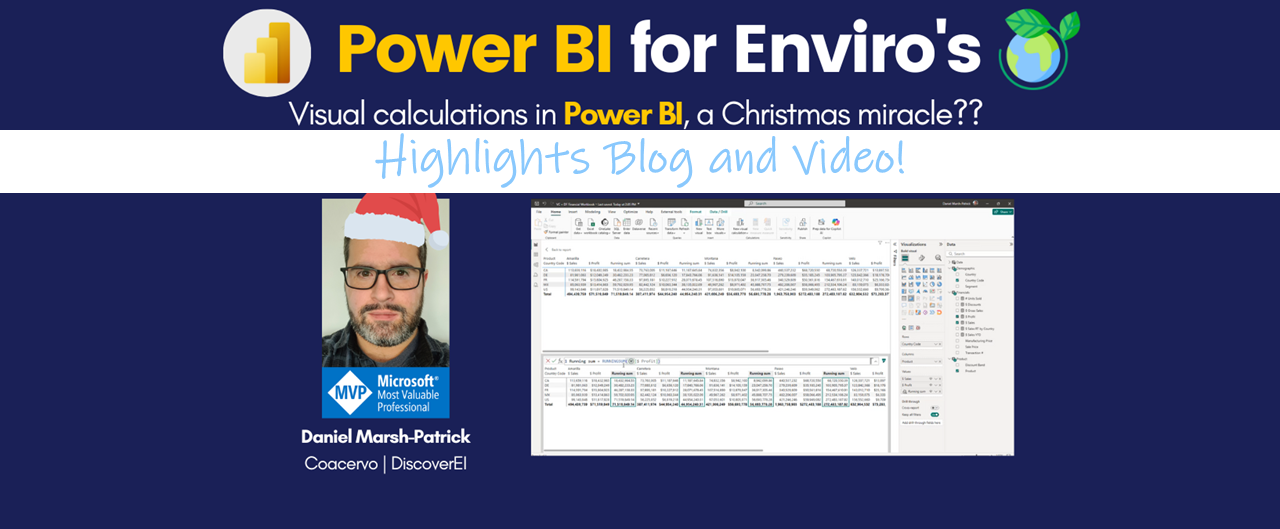
In this session, Daniel Marsh-Patrick (Coacervo | DiscoverEI) took us through the recently released Visual Calculations in Power BI. Using a simple dataset, Daniel explained the basics of this technique and demonstrate practical use cases where Visual Calcs can be used to replace often semi-complex DAX statements.
Investments in projects that aim to capture and store carbon in vegetation and soils are often based on potential cost-effectiveness. That approach can overlook the people and communities who live where these projects happen – the very people whose participation and support determine whether initiatives succeed. To bring social and economic contexts and impacts into the frame, the CSIRO team developed a Social Intel for Sustainable Investment Decisions dashboard with DiscoverEI to spark dialogue with partners around the social and economic data that could help inform investment decisions. Dashboard available: https://research.csiro.au/vsfsp/valuing-local-provenance/.
This session drew on a new open access paper published in Sustainability Science (https://link.springer.com/article/10.1007/s11625-025-01729-0), that shows how social measures could help inform carbon abatement investment decisions. The paper describes work from a partnership between a project team in CSIRO’s Valuing Sustainability Future Science Platform and the Queensland Government’s Land Restoration Fund.
This session presented the innovative Power BI techniques used to create the DCCEEW (NSW State Government) Biodiversity Indicator Program (BIP) Power BI Report, viewable here: https://www.seed.nsw.gov.au/nsw-biodiversity-indicator-program-habitat-condition-dashboard
From an environmental perspective, the tool reports on the state and trends of biodiversity and ecological integrity across key areas in NSW. From a Power BI perspective, the session presented on some key features to include for public facing tools, and touched on some great Power BI hacks!
AI is reshaping industries faster than we ever imagined, and nowhere is this impact more profound than in the world of structured data. With tools like ChatGPT, Microsoft Copilot, and generative AI becoming mainstream, there's a growing fear - and excitement - that AI might be coming for our data jobs. But what's really happening?
In this session, Greg takes us through the current state of AI in the context of structured data and analytics, cutting through hype to understand what's genuinely possible, what's at risk, and what opportunities are emerging for data professionals. It was a robust and engaging discussion which helped to clarify the realistic understanding of AI's impact on structured data roles and how to position yourself (and your team) to stay ahead.
We often assess environmental data against one (or more) guidelines but it can be notoriously challenging to model, calculate and visualise inside of Power BI. In this session Alice explored some real-world tips and tricks for working with guidelines and exceedances in Power BI, and Daniel showcased a custom Deneb visual he created to highlight water quality exceedances over time, and share his lessons learnt for improving report efficiency!!
The DiscoverEI and Blue Mountains City Council (BMCC) team worked together to create the public-facing healthy waterway explorer dashboard (available here: https://www.bmcc.nsw.gov.au/waterquality).
In the session Amy StLawrence (BMCC Aquatic Systems Officer) and Alice Drummond discuss the project from start to finish, including: challenges faced; meeting the teams' vision for the report and arriving at the final solution.
The session also explored useful Power BI techniques and visualisations for showcasing this type of environmental water quality and waterbug data, to help inform data-driven decision making across the region.
In this conversation, Mark McClure discusses various AI tools, particularly focusing on ChatGPT, Perplexity AI, and Copilot, and their applications in data analysis and research. He demonstrates how to gather data for fossil hunting in Kansas using these tools, organize it in Excel, and visualize it in Power BI. The discussion emphasizes the importance of experimenting with AI tools and showcases practical steps for data manipulation and visualization.
Interactive dynamic reference layers are now possible in the Azure Map core visual for Power BI! In this short video blog, Alice walks through this new feature (released Oct 2024), how to configure them in your Azure map and several ‘Gotchas‘ to be aware of in the first release of this feature! I hope this helps you have fun exploring maps in Power BI.
Do you want to learn how to design engaging and intuitive Power BI reports, which communicate your key insights at a glance and tell your data story?
Our two-day Power BI training course is designed specifically for Power BI Professionals and Data Analysts, and provides our best practice tips, tricks and hacks to help you transform your data! We provide this course online, in-person group sessions, or customised in-house training for your team. Places are limited (max 8 participants per class) so secure your spot today!